Tableau work
This post will go through a couple of examples of the work I have done in Tableau. Charts are stripped of axis info to censor any sensitive information. Example are simple as it is difficult to show details of my work in a censored way.
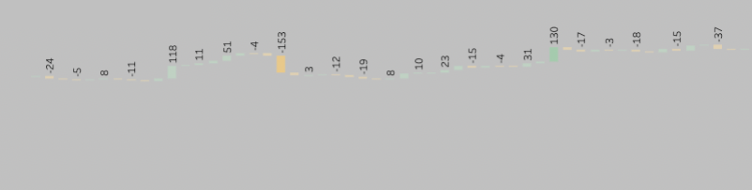
Waterfall chart
A waterfall chart is an interesting way of showing developement over time. Each bar represents a day, week, month eg. and the change at that point in time compared to the previous day, week, month. That way you can easily see how much you lost or gained.
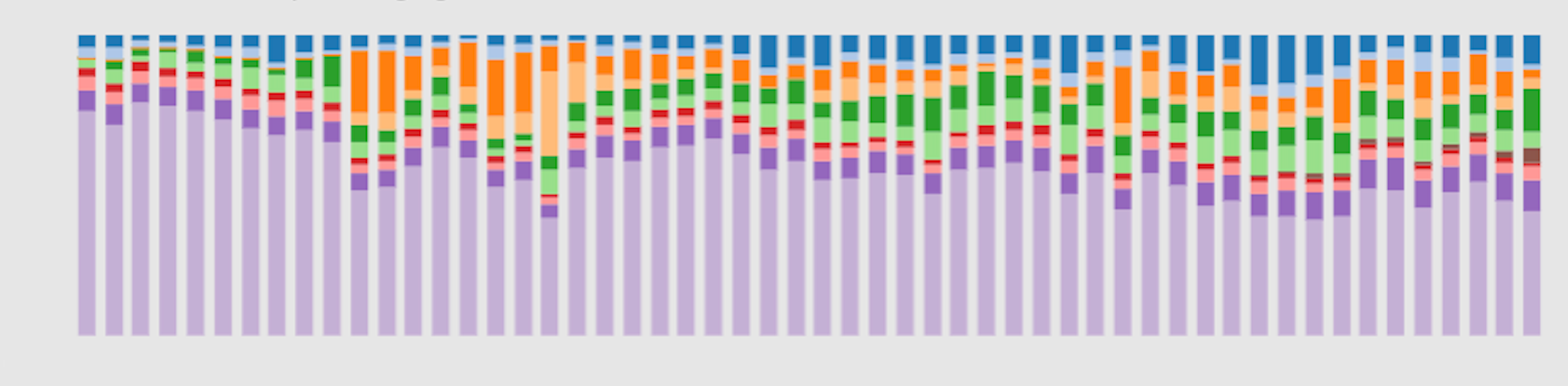
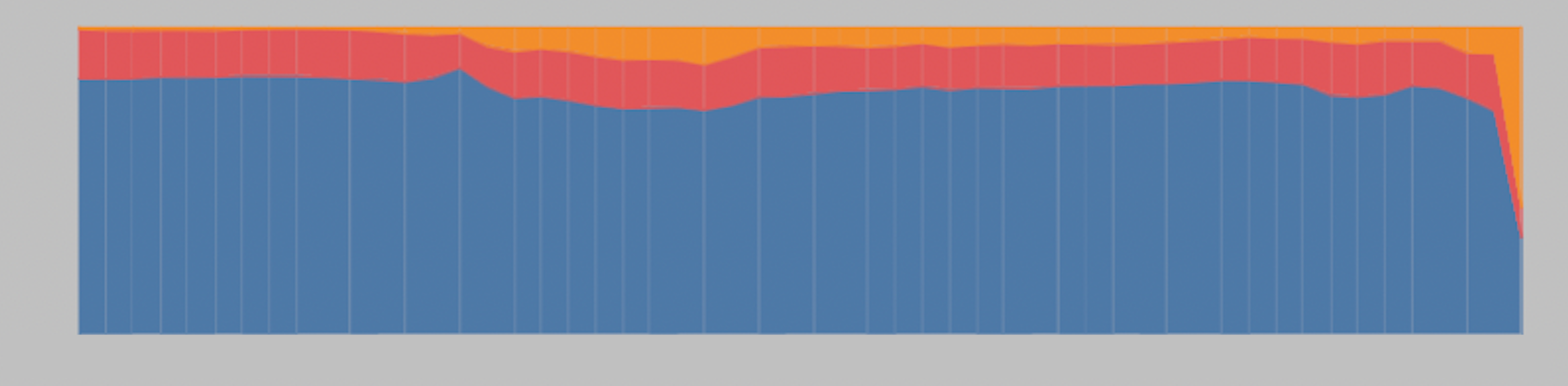
Stacked bar charts and share of total
When looking at stacked bar charts it is always a good idea to also create a share of total chart. In the first chart the colors could represent some kind of category, product or department, the y-axis would be revenue, user count or some kind of volume and finally the x-axis would be time.
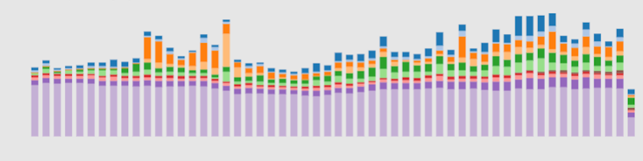
This would give us the actual numbers, which are important, but the next chart would give us a quick understanding of the share total. So below the colors and x-axis are still representing the same as above but the y-axis is now percentage always adding up to 100%. So y-axis would always be from 0% to 100%.
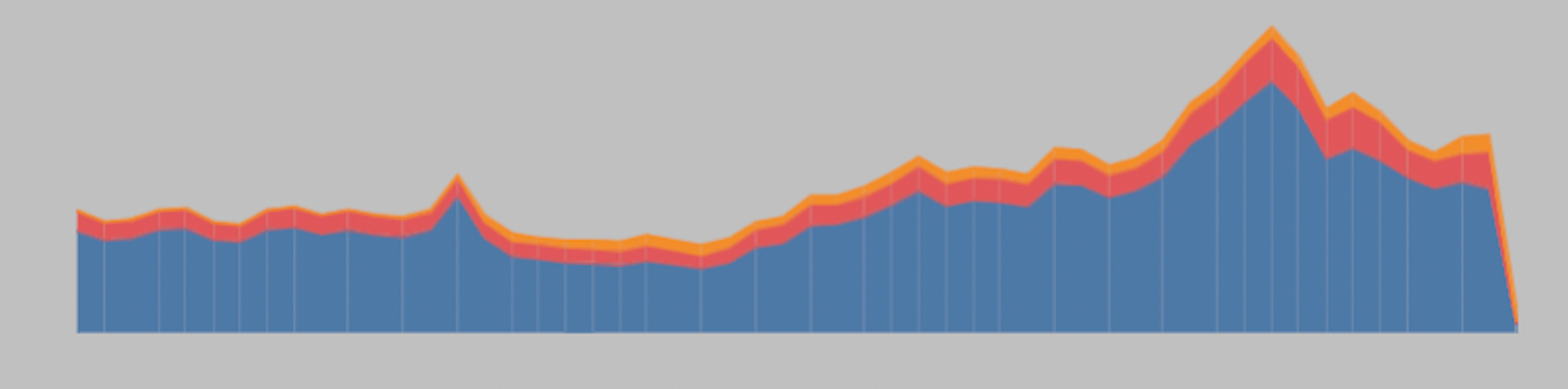
Area charts
Area charts can be preferred visually instead of bar charts. Below we have just 3 categories indicated by the colors, but the concept is the same as above.
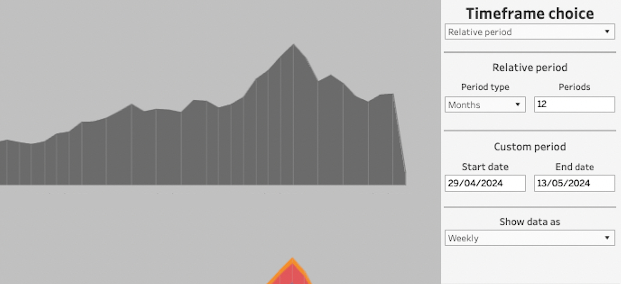
Custom timeframe filter
Tableau has some pretty good built in options for adding time filtering and aggregations to your dashboards. However, if you want to give the user more flexible options that are out of the ordinary, you have to build something using parameters and calculated fields. Below you can see a filter I built that gives the user option to filter on a relative period, a custom period and aggregate the data on various timeframes.
The relative period means it will show data from a certain point in time until present day. It could be the last 12 months, the last 12 weeks, the last 14 days etc. The custom period simply allows the user to filter the data between two points in time. From 1. januar 2021 to 31. of december 2021 for example. Lastly, “Show data as” will aggregate the data so each bar represent a day, week or month.
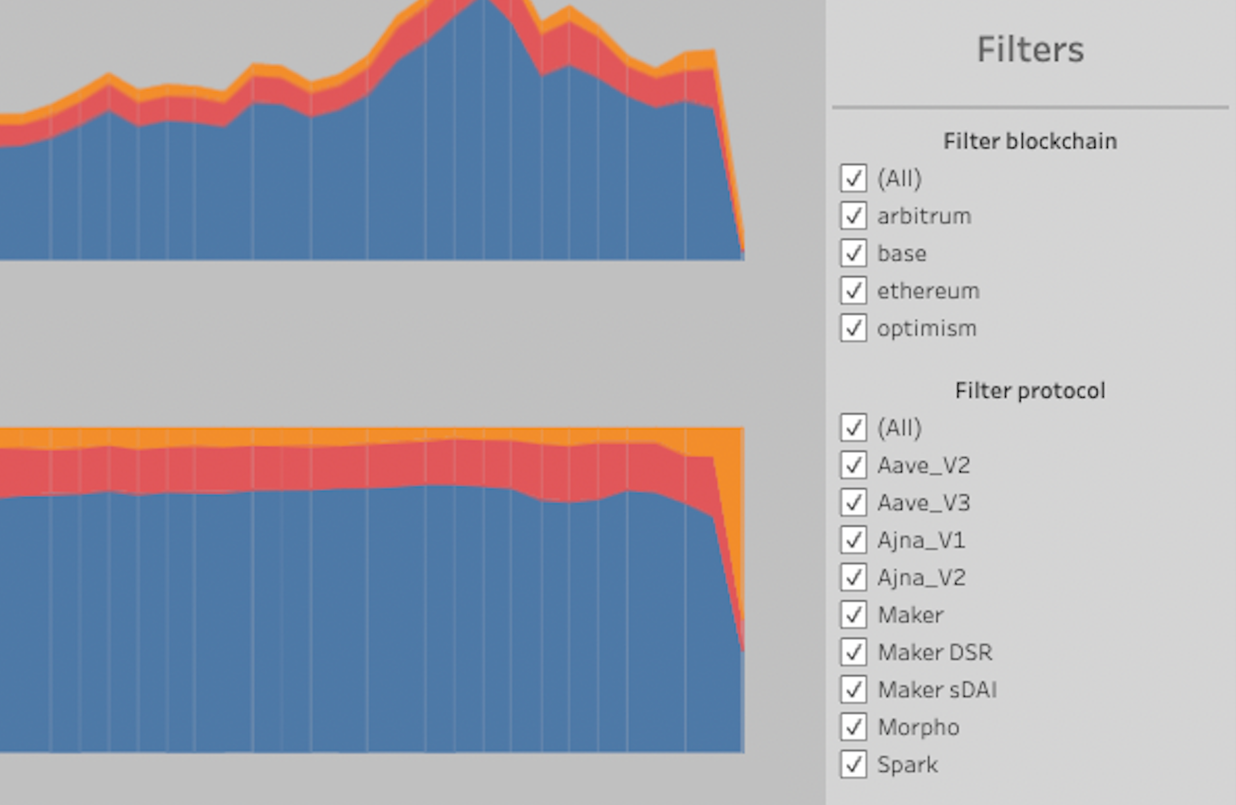
Filters
Filters are a good way of giving the user of the dashboards some autonomy to dive deeper into the data. You can make multiple choice, single choice, sliders etc.